Watercolor in Turquoise

A little over a month ago I found myself at an art supply store and decided it would be cool to buy a tube of watercolor, and I landed on a turquoise.

What other color would I have chosen?

watercolorcoralcurves2lilypadv2mug

Last week I bought a couple other colors, so expect some color variations in the future!


Semi-Beginner’s Guide to Fabric Design

You know the idea of a side hustle? I’ve had (and have) many of them, and one of the ones that most intrigued me for a long time is designing fabric.

multi

I love doodling, and always thought it would be awesome to have those doodles on fabric. So when I moved to North Carolina in 2014 for school, I found out that there was a way I could actually put my designs on fabric (aka Spoonflower!)!

I had been designing things for my Redbubble shop at the time for a year, but fabric was a game changer (in my head, at least).

Quickly I realized that fabric repeats are challenging. So for most of the designs I posted and tested early on I went the easy way and made a small design and let Spoonflower’s design “software” handle the repeats. Which was great!

This has not been a lucrative endeavor for me, but my Stargate inspired designs have gotten a lot of love (thanks to the geeks and geek-loving family members for supporting them) so I had some Spoondollars saved up and I wanted to upload some more of my designs, specifically my mandalas, while also expanding to maybe other things!

ocean

So I did some research and learned some techniques for making repeats both physically and digitally. You can see the fruits of that labor in the pictures throughout this post, and I can’t believe how adorable this ocean creature print I made is… I don’t care that I’m bragging. It’s so cute, right?

The paid thing I found was this series from Creative Bug… Kinda like Audible, you get to “keep” one workshop a month (or something like that), so I still have access to these (darn you autopay!), but I found it soothing and fun to watch. Basically 3 or 4 designers give a peek into how they make their fabric designs, how you can make it on paper, and how you can make/translate the designs to digital means in Photoshop, though the idea should be pretty much the same for Gimp, if that’s more your speed.

I also know there’s some courses on Skillshare, but I haven’t given them a try yet.

If you want to stay entirely in the physical world, Megan Nielsen had a great set of posts out a couple months ago about a screen printing class she took, which you can see here!

Spoonflower has a handy tutorial for doing repeats by hand, which was specifically what I followed for the artwork above, of cutting up your sketch and taping back together to distribute your pattern. And here’s a post of repeat resources Spoonflower put together!

Then I scanned it, edited all the animals, and then used a tutorial for Photoshop to get the repeats to work… but I’ve now checked every bookmark on my browsers and I can’t find it… (edit: it’s now linked!). There are many options if you google repeating patterns in photoshop, so I’m sure you’d find a great one!

seedpod

I’ve now gotten the proofs, and I’m ready to sell more of my original designs! I’ve made a bunch of my mandalas available for sale in different scales, with the same technique of letting Spoonflower make my repeat for me. I did find that washing dulled the colors, or at least made the black background of some designs more of a very dark grey, but overall it’s still great to see my designs on fabric in person!

undertheseaspoonflower

What’s your favorite kind of design to see on fabrics?

How I Make Digital Mandalas from a Sketch

Welcome back for what has become week 3 of my mandala tour!

Today I’m going to show you how I make mandalas from sketch to finished digital product. I do want to note, though, that this isn’t a great process for digitizing a fully drawn mandala, like the one I showed you last week. That’s more of a finesse and fuss problem, which I haven’t mastered yet.

I’ll be using Adobe Illustrator primarily, which is a vector based software that allows for layers. Similar softwares are CorelDraw and Inkscape, the latter of which is free! I haven’t used it before, but its an option. I’ll point out where you could use something like Photoshop to carefully complete the steps.

So let’s get started!

guides

First you’re going to want to draw some guides at recognizable angles, or at least angles you can remember, so bring out the protractor!

sketch

Next, in pen, draw in a design of your choice! It’s hard for me to visualize what a design is going to look like when extrapolated to a mandala, so I just doodle and hope that it won’t look too weird or wacky. Then either take a  picture of it from directly above, or scan it in!

I did briefly bring it into Adobe Photoshop for editing, mostly just upping the contrast and cropping…

Then open up a new document in Adobe Illustrator, and place the image into that document.

4

Lock the picture in place, and draw in a vertical or horizontal line, and then copy it, and rotate the second line to your angle. (Mine was 30*, in case you were wondering…) Make them obvious in some way, whether that’s thicker, or a different color, or both!

5

Then start drawing in shapes and lines!

(If I was working in a raster software like Photoshop, I’d draw/paint in the designs on a new layer, trying to keep inside of the lines I just created, then clean it up with an eraser and skip to the flip and rotate step. )

6

Make a copy of the guidelines that you made earlier, and stack them on top of the originals, then use the Shaper Tool (it looks like a circle with a pencil in the front) to “erase” parts of the shapes you made earlier. The guides will naturally cut the shapes at the proper angles for flipping and rotating!

You can definitely go back and forth between the previous and this step until your design is set! I think I went back and forth at least twice to get it to the above state.

7

Now you can turn off or delete your reference image, and I like to change the color to black for visuals… Lime green is pretty annoying to look at after some staring, right?

You should also be able to turn off any other guides too.

Now, select all the parts of your design, and group them together, then make a copy. Reflect this copy over the axis of your angle. In my case, I originally reflected the copy over the angle 120*.

Adjust the two groups so they meet up, or make changes to the paths until they do. Then reflect the combo over the next axis, and repeat.

10

By adjusting, I mean, drawing in new circles, if the parts don’t properly match up, or extending vectors so they meet, etc. Mine didn’t match up exactly, so I had to do a bit of cleaning up, and that is totally fine! If you drew in the details in Photoshop, you can paint over until the pieces match up.

11

And when you’ve gotten back to the beginning, you’re done! You have made a digital mandala!

(Unless you want to color it in… If so, continue on!)

12

For coloring, I used the Live Paint menu in Illustrator, and messed around with colors until I liked it. You could also do this in a raster software!

13

And here’s my finished mandala!

Export it as a picture and you’re set!

If you like the mandala from this post, check it out on Redbubble!

How I Make Mandalas by Hand

So last week I shared my introduction to mandalas, and I thought it’d be cool to share how I draw mandalas!

This week I’m sharing how I draw them by hand, and then next week I’ll show you how I do it in Adobe Illustrator, the process of which could be adapted for other programs!

supplies

First I gather up my supplies, including a protractor, a compass, a pencil, a ruler, an eraser, and some kind of inking supply (I’m using a set of Faber Castell Pitt Artist Pens).

cross

Then I’ll draw out two perpendicular lines, trying to center it (and typically missing the center).

protractor

rulerguides

From there, I can use my protractor to mark out various angles from the center cross, and then I’ll draw them in with my ruler.

compass

guidesdone

Next I’ll use my compass to draw concentric circles out from the center.  I tend to make a bunch of guides randomly assorted and then build the design around it, so I try to make at least five circles to give a good base.

framework

Then it’s time to build out a structure. I make a general pattern, like these boundary circles and the arch patterns, and I’ll continue this all around the mandala.

nearlydone

After the structure is done, I’ll decide on the details and start to fill out the mandala. I’ve been partial recently to dots, parallel lines and swirls. In this one, the swirls turned into caricatures of waves, and I think it made a neat pattern!

done

And then the mandala is complete! Sometimes I’ll choose to color it in, but for this one, I really liked the simple black and white look!

Tune in next week for my more digital variation!

how i make mandalas by hand

Mandalas and Me

I had a moment at work over last summer where I said the most artist-y thing I could imagine myself ever saying. “Oh yeah, I’ve been kinda getting into circles.”

It was just the funniest thing, in hindsight at least! Who doesn’t like circles?

But a couple days ago, I came across the make I was working on in that moment, and it prompted me to think over my connection… with circles.

When I was young my parents would bring us to art museums with sketchbooks and colored pencils, so I did a lot of (what would now be considered) abstract art. They weren’t all recognizable.

My uncle had made what I would call “Doodle Art” for my grandmother when I was in elementary school, so by the time I hit middle school I was doodling in the margins of my math work… Sorry math teachers!

squiggles2
Unfinished, and there’s the water stain… It went through about 20 pages…

I just pulled out some of my sketchbooks from high school, and I found some cool squiggle doodles I was working on back then, so I have proof that I was doing circular-ish stuff back then!

Then when I was in college something magical happened. I was introduced to mandalas in a spectacular way! My college invited a group of Buddhist nuns to our campus to make a sand mandala.

keydong
Credit to Trinity College

Every day or two I would stop into the black box theater on campus to watch the incredibly intricate mandala develop and to watch the thought and the concentration that these nuns put into this beautiful work. Even though I missed the organized events due to school and work, I felt connected to the mandala every time I took off my shoes to pad into the theater and observe the work as it progressed.

Alright, let’s cut to April 2017, when I desperately needed to make a wedding gift for May, and I decided I would laser cut coasters, but then the question became, “What am I going to put on the coasters?”

Pinterest did not let me down, and I saw so many cool ideas, but the mandalas stood out to me. And that was when I started to draw my own!

sketches2

For most of the time since then, I’ve drawn in an eighth or sixteenth of a circle pie slice, then taken a picture of it,  and redrew the entire thing in Illustrator.

When my pie slice was drawn up, I’d then flip and rotate and flip and rotate (etc) until I had a full mandala. There might be a little bit of clean up, or combining of paths and such, and then I had a finished design!

intertwinedblackminuswhite

I’ve put these digital mandalas on coasters, on ornaments, on magazine boxes that I use for organization, on digital websites for downloads, on coloring pages for download at my Etsy shop, and most recently on fabric!

green mandala full

About a month and a half ago, I decided it was time to try doing these mandalas by hand, just like the nuns I had observed six years before (except… with paper and pen instead of sand). I bought myself this compass, which is weighty and will accept a mechanical pencil or slimmer, and used a protractor, and so far I’ve drawn about 10 entirely by hand!

Here’s a couple videos to show you my sketching, inking, and coloring process!

So saying, “I’ve kinda been getting into circles!” is not true… It looks like I’ve been loving circles for a long time!

Sewing Journal – Shop Update

I started using a bullet journal is 2016, I think. And some of the pages are simple, like my log of savings and investment account tallies, and some are more complicated, like anything related to DragonCons.

patterns.jpg

After getting the basic setup, I was thinking of what pages I could add, and there were a lot, but one of the first was a log of what sewing patterns I already owned, both clothing and other. Later I figured out that I don’t have any non-garment patterns, that I can find at least. It’ll be my overflow, when I get that many patterns.

sketches

Sometimes I’ll use my bujo for sketching as well, like in this Summer Sewing and Knitting Plan. Was I super ambitious with this? Yes. Was it created about two weeks before I realized I had to get my butt in gear for DragonCon? Yes. Am I happy that at least 2 of these are complete? Absolutely.

alterations

One of the earlier pages was just a simple list of alterations that I needed to make, since I’m firmly in camp “fix it and only get rid of it if you can’t love it” but also camp “put it in a corner until you feel like dealing with it.” Writing it down makes it more real for me.

I’m not good at keeping up with daily, monthly, or even irregular logs, though. I get about 5 month spurts of bujo usage and then it gets shelved for a few months. I’m about to give my bujo another go, but I decided to keep my sewing stuff separate this go around.

So I needed a sewing journal! I started with the pages I knew I needed, so I made ones to match those above (these are now called “Sewing Patterns I Own” and “Sketches” and “Alterations to Make”), as well as some for fabrics, and some for projects.

fullplanner

Here’s the official list of pages:

Customizable title page where you can write in your name
Title page that simply states “My Sewing Journal” (because you know who you are!)
Sewing Patterns I Own
Sewing Patterns I Want
Specific pattern notes
Specific pattern notes with lines
Index for fabric (20 lines)
Index for notions
Fabric description page with room for type, color, quantity and description for three fabrics per page
Fabric description page with room for the above and a 2” square swatch for three fabrics per page
Measurements. We need them, so here’s a page.
Planning page for organizing six projects with fabric and patterns
Specific project page for making plans and notes
Specific project page for making plans and notes with lines
Alterations page for cataloguing six alterations to make
Mood board page
Sketches page

titlepageprojectpages2projectpagespatternpagesmeasuringfabric indexfabricpages

The file is designed for letter sized paper, since I live in the US, but if I were going to paste these pages into a notebook, I’d probably shrink them in the printer menu to a smaller size and cut them with scissors. It’s crossed my mind to do that, but for now it makes sense to me to keep it in my filing cabinet, since I’ve got the space.

So if this is something you’re interested in printing and using yourself, check it out at this link, and you can find the rest of my Etsy shop here!

(I am thinking about making one for yarnstuffs, since I also have a bit of a yarn hoarding problem… Let me know if you’re interested!)

Do you like coloring?

I’ve embraced coloring recently…

day2.JPG

And by recently, I mean I’ve been doodling for my entire life, but mostly in black ink on white paper. To the point that I tried to bring myself to buy a white gel pen, or paint pen, or something to draw in this black paper notebook I’ve been carrying around for 4.5 years. And it didn’t work.

(I’m only a low grade hoarder, I promise.)

IMG_20170523_172310.jpg

But I’ve been drawing mandalas specifically for laser cutting, because there’s something so cool about lasers, and sometimes I found myself coloring them in, both digitally and . So when I was having a mid-20s crisis (I know, it’s ridiculous, and I won’t dwell on it) I started an Etsy shop for coloring pages of my mandala art.

All of the products as of right now are digital downloads as PDF files, so they will either be emailed to you or they’ll live in your Etsy account. You do need a PDF reader for them, but I think most readers of blogs probably already have that…For almost all the products, there are both letter and A4 sized pdf pages, though you can always use your pdf reader’s print page to resize things.

So there’s coloring pages, since that was the original idea, and with both letter size and A4 size there are downloads for black lines and for grey lines, because some people like the lines to fade into the background.

Also I’ve been digitally coloring some of the mandalas, so I’ve released some print-at-home art prints that have already been colored in. Wow, print-at-home art prints is a mouthful, even typing it.

I’ve expanded a bit into calendar and planner pages more reminiscent of bullet journals, like spending logs, since that’s something I’ve dabbled in. I’m not good at keeping any kind of log long term, but everything I put up for sale is something I do or did use.

fullplanner.jpg

For instance, my newest offering is a sewing journal, which is a printable version of pages that I was already using in my bullet journal. I’m going to do a separate post on that later this week, because I know that a lot of you guys, my followers, are sewists so it might be something you’re interested in.

Really really long time subscribers might remember me talking about my old Etsy shop, which was a handmade beadwoven jewelry shop, and at least for the moment I have no plans to reopen it. I still have all my stock, but I have yet to feel the pull of jewelry making that would prompt me to reopen it. Maybe in a few months I’ll try to sell off my stock in this new shop, but for the moment I’m keeping it simple.

I’d be honored if you gave the new shop a look! I opened it about a month and a week ago, so though it’s not super new it’s still a little shiny for me. I’m going to go give it another shine…

The Moment

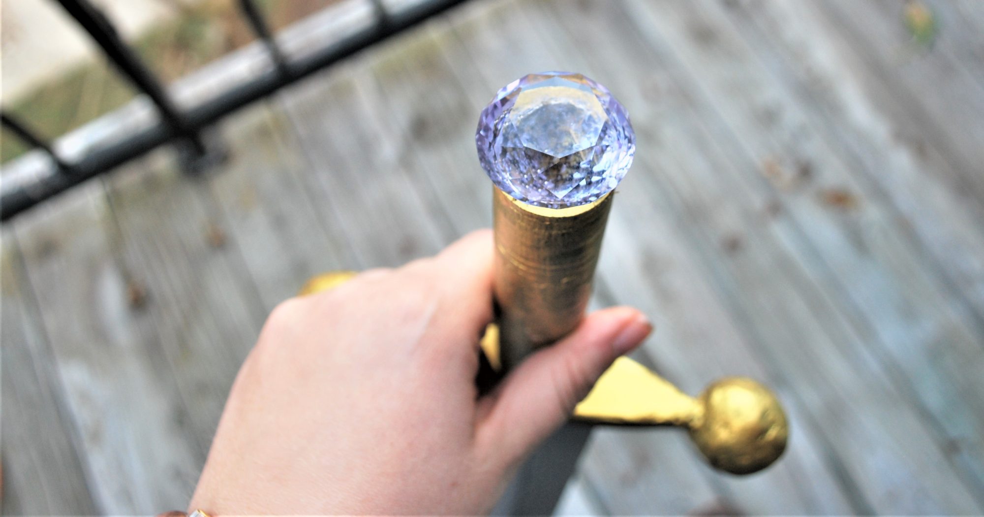
When I posted Spring Updates I wasn’t sure if I’d be posting again about this prop, at least not until I had completed the costume to go with it. But that has been postponed for a smidge, so I think its time to share!

If you don’t recognize this prop, you probably didn’t see the Doctor Who 50th anniversary episode. That’s okay! What you should know is that it’s central to the storyline, as its the most dangerous weapon in the universe, so dangerous that it has a conscience, who just so happens to appear as Billie Piper’s character Rose, or rather her image, but calling herself Bad Wolf. If you find that a reasonable thing, then you should definitely join the Whovians!

Anyway…

Last October I fell in love with a (relatively) new technology: LASER CUTTING!

And when I say fell, I mean I fell hard.

The panels of this prop were the 2-7th things I ever laser cut.

So I was completely new to Illustrator, but this project (and everything I’ve designed since) has taught me so much!

Back to the prop… I used photos found on the RPF (here and here) as references, and then designed all the sides. 5 of them were reasonable, since there would good references, but the one with all the Gallifreyan was more difficult. Only half-ish was ever visible, so I made a lot of fake Gallifreyan… Which was entertaining. And some of it looks reasonable, and others… Don’t. Luckily it’s only about 12 by 6 inches of ridiculous.

And I’ll probably be one of the few that cares.

I went on a week long “bender” of designing and laser cutting. I would design something one night, cut it out the next day, and then turn around and design the next one that night!

Then came time to take them all home and paint them. All the metallics are Jacquard Lumiere paints, and I used some cheap acrylic paint for other bits.  I think I had everything painted by December. And then my project brain stalled. (In January I found myself working 2 part time jobs, plus my grad school research so everything shut down. Like this blog, for the most part.)

In March, when things had mostly settled, I found myself with the inkling to get in the wood shop to make the frame. I ended up splitting two by fours for the final product, and creating an empty cube. I spent a lot of time sanding it down and trying to get many of the imperfections out. Some of the wood I had used had some kind of black paint on it, so I had to sand it down a lot in places.

Then I made the bad decision to wood burn the frame by hand. In the show prop, it was probably laser cut, but I wanted the deeper worn look. I spent 6 hours over 3 nights working on it (from 10pm to 12am) which was not my finest decision…

I borrowed some stain from a friend, and stained the entire thing, which was a kinda messy affair. My bathroom looked like a crime scene for a few hours. The stain was oil based Zar, in color Rosewood.

Then came Easter weekend. The laser cut panels were “installed,” meaning pressing them until they fit and attempting to glue them together cleanly. I had installed a small “door” into the corner of one of the sides, so I installed hinge hardware, and used some foam board leftover from a friend’s project to fill in some gaps between panels.

I was marathoning the project at this point, so I managed to get on Tinkercad and designed the corner caps, which are essentially 3 sides of a cube with a half sphere, and printed them. For a first 3D project, they turned out unexpectedly perfect! I primed each with some cheap primer spray paint and then painted the corners grey with acrylic paint mixed with some silver Lumiere paint. Then everything got glued together and I used a clear coat over everything, from the wood to the 3d to the laser cut stuff.

But this thing is huge. It’s bigger than the actual prop, and I can hardly hold it. So it takes up a remarkable amount of floor space. So I laser cut an acrylic topper, and I use it as a coffee table!

The intention was that this would be a prop useable for DragonCon, but as I said it is huge. I think it measures 16 inches cubed. I have trouble picking it up, due purely to the dimensions, though the weight would be a problem an hour in…

I’m thinking that it might be worth it to make a smaller one. I’ve only got two months, but I think I can cut down the working time to a two week period, if I do it again, since I know all the steps, and the only real thing I’ll have to buy is stain for the frame. I would definitely laser cut the frame though, before assembly, since it was way too much time to burn it by hand…

We’ll see what that idea comes to!

Design Donnerstag – Politely

So last week I made up a lovely illustration of a pistol… with reasons.

I didn’t just decide, “Ooh, I’ll just draw a pistol today”… no pun intended.

I wanted to draw Malcolm Reynolds’ pistol, but figured I should start with a slightly less future one.

Then I added some of the great future-y elements.

politely

And the quote.

Because who else would instruct their crew to shoot people… politely?

No one, that’s who. Except Mal.

Design Donnerstag: The Moment and Falling

Recently I got the idea to bring my artists tablet to my office at  grad school, as there are a few times that I have nothing much to do, which lend themselves greatly to designing things.

Meaning midday Friday when I have a three hour chunk of time between classes… And the likelihood that I would do work over my “extended lunchtime” is small.

So last Friday I finished these up!

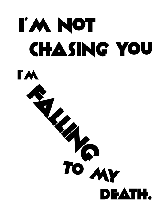
A simple text based design of a Claudia quote from Warehouse 13:

fallingdeath

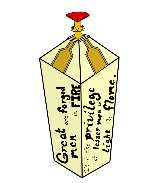
And an illustration of the Moment button from the DW 50th Anniversary episode. Because why not!

great men

Plus the quote is lovely. If a little sad.